The Western Journal
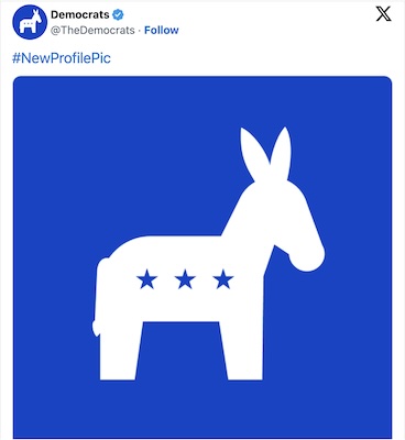
Just after noon ET on Wednesday, the Democratic Party dropped its new logo on social media. As you’re no doubt aware if you spend any time in that corner of the universe — or have paid attention to politics anytime in the past couple of decades — the Democratic logos have been a red-and-blue donkey (the mammalian representative of the party bequeathed upon them by cartoonist Thomas Nast in the 1800s), with four stars inside the blue upper half, and a blue D inside a blue circle on a white background.
Apparently, they felt the need to consolidate. So, the new profile pic just dropped, and … well, this is apparently what they thought people wanted in a rebrand: More

Looks like a pinata
I present to you… The Buddy Ass!
Does it have mumps?
How fitting that a dick is coming out of its butt.
It could be worse. It could be doing the Tijuana Donkey dance with AOC….
So, they think all they need to do is create a new logo. So very like the Leftists to prioritize something like this. When do they start calling themselves something else besides “Progressives”? That always seemed to work.
“It could be worse. It could be doing the Tijuana Donkey dance with AOC….”
LMFAO. Seen it, on here my fans only page. She fucked the donkey to death.
It’s an ass with holes in it. Assholes!
I’m gonna print a few, 18″×18″, for the range…
Buttshot, gutshot & lungshot.
Did they blame to old donkey logo for Kamala’s loss?
Is a donkey’s head 30% of its total body?
With that head it and looking like it is major front heavy, it looks like it would do a FACEPLANT with every step it would take. Of course the Leftists do that on a daily basis anyway so they needed a new logo that is more fitting.
I wouldn’t give that ass any stars let alone three!
Why don’t we call the democrap party what it really is the jackass party.
Their still Asses.
The woke makeover completely imploded, they just were not smart enough to tell the freaks and fairies, dykes and harries to take their fucking attention seeking bullshit and shove it straight up their ass until it was too late.
What they are left with is a coalition of broke ass fucking retards that are fighting amongst themselves
geoff – That’s partially why I call Biden Jackass Joe!
1 – He is a member of the jackass party.
2 – He truly is a jackass in every meaning of the word!
Lol – Hogg had to simplify the logo ’cause the last one was too complex for him to understand…
@ 1044: usage of “their” – their dog just shit in my garage…because they’re (they are) useless assholes.
Classic shithole banana republic commie representative. The donkey, probably the most worthwhile entity that exists in the whole of the undeveloped socialist third world. Certainly the people aren’t worth a squeeze of diarrhea, Bidenbama’s open borders have shown us that.
did they super-impose mulvaney’s face as the vagina & hogg’s face as the asshole?
As opposed to a five-star, MAGA Trump elephant.
where are the piles of shit @ both ends?